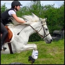
I've made a few minor changes to the blog - a minor title change (since McKinna is no longer the only horse I actively ride!), addition of a header picture, and a little fiddling with the side bar.
There's now a 'Popular Posts' piece, where you can visit the blog posts with the most comments. There's also an RSS feed link to subscribe to posts and comments. I'll continue making some little tweaks here and there (I admit that, though I'm a teenager and therefore should be 100% tech savvy, I am pretty much clueless about feeds and subscribing - O! The shame!) but nothing too big.
I've got a busy weekend ahead of me: Friday jumping lesson, Saturday Quiz Rally, Sunday dressage lesson!
Keep your eye out for some upcoming posts: I'm going to finish the Presentation Series that I started (finally, I know) and do a short series of posts based on all the information I have learned while studying for Quiz Rally.
Come With Me Now
2 months ago


5 comments:
I was just thinking about you!
Not everyone can be a tech whiz, B. If it worked that way, the competition for jobs would be insane!
Love the new header. And it's hard keeping up with more than one blog -- I speak from experience.
Re being tech savvy: in order to get that way, you have to spend inordinate amounts of time playing to figure out all the bells and whistles. Who has that kind of time??
Oh, I know. I just feel that as a Gen-whatever-er I am, I should know everything about computers! As it is, I'm doing pretty well, and I did figure out how to set up the email subscription box. So now if you want to get notified by email when I post, it's right there!
Leah - my boyfriend got a beautiful camera (Cannon Digital SLR something with lots of numbers) and I talked him into spending an evening at the barn while we free-longed the girls in the arena. He was still learning how to use the camera, so most of the running shots turned out pretty blurry like the header, but the effect was very cool!
Mega fancy header!!! Now I want to go get a free Photoshop trial and go at it.... only I know I'd fail.
It's not that fancy :) All the blurriness was actually in the photo. All I did was resize, crop, balance the levels, and add the text. Which I then made a little pretty and glowy, but you know. It's all fairly simple!
Post a Comment